Alright folks, grab a coffee because this one got weird real fast. I was knee-deep in datasheets for some power MOSFETs – trying to figure out why this circuit kept acting like a stubborn mule – when this term “energy band diagram” kept popping up like an annoying fly. Everyone just expects you to know it, like it’s obvious! “Oh, just check the bands!” they say. Yeah, right.
Where The Frustration Started
Honestly, it felt like staring at hieroglyphics. These diagrams are supposed to explain how the stupid gate actually controls the flow of electrons in the channel, right? But looking at them was like trying to read a map drawn by a drunk spider. Curved lines going up and down, labels like “Ec” and “Ev”, that ‘E_f’ thing wandering around… I mean, come on! How was this supposed to help me?
My gut reaction? Skip it. Who needs this headache? Just plug the numbers from the datasheet into the model and pray it works. Worked… sometimes. But when it didn’t work? Total mystery box. Why was the threshold voltage shifting? Why was the leakage so high? Felt like trying to fix a car with mittens on.
The “Fine, I’ll Look Into It” Phase
Frustration finally boiled over. Okay, FINE. Why do people even bother with these squiggly line pictures? I wasn’t aiming for PhD level, just wanted the basic “aha!” moment. Started poking around, looking for someone who could explain it without making my head explode.
Found a few talks that basically said: Forget the complex math for a second. Think of the energy band diagram like a picture of the hills electrons gotta climb over inside the MOSFET. That clicked a tiny bit.
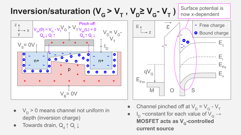
- That “Ec” line? That’s the peak of the mountain. If you’re an electron wanting to zip around freely in the silicon (like, actually conduct electricity), you gotta be above this line. Otherwise, nah, you’re stuck.
- That “Ev” line? Think of it like the valley floor below the mountain peaks. Holes hang out down here.
- The Gate Voltage? THIS is the cool bit. Applying voltage to the gate is like grabbing the landscape and physically bending it! A positive gate voltage? You’re pushing that mountain peak (Ec) DOWN towards the channel material underneath. Making it easier for electrons to get over the top and flow.
- The Oxide Layer? That thin layer under the gate? The diagram shows it as this massive, thick wall. Why? Because it IS a huge barrier! Electrons absolutely cannot cross it easily – that’s why you get control! The diagram screams “DANGER WALL!” visually.
The “Oh, THAT’S Why They Bother” Moment
Suddenly, things started making ugly, beautiful sense. That annoying diagram wasn’t just decoration:
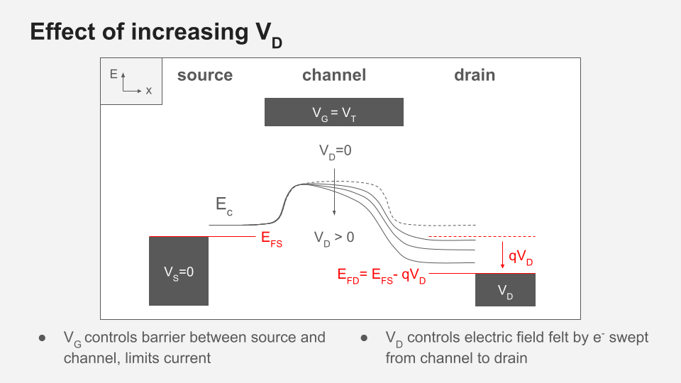
- Why the Gate Voltage Matters So Much: Seeing how much you bend the band (Ec downwards) makes it clear why increasing Vgs lets more electrons cross into the channel region and start flowing. Bend it enough, and boom, conduction! Seeing the “hill” flatten visually explained the exponential relationship my math model uses.
- Leakage Current Nightmares: That thick oxide barrier picture? If it wasn’t there, or wasn’t tall enough (bad material?), the diagram shows electrons could just sneak over it from the gate or from the drain/source even when you don’t want them to. Hello, weird leakage current!
- Threshold Voltage Isn’t Magic: That critical voltage where the MOSFET just starts turning on? It’s literally the point where your gate voltage bends the channel band enough that the “mountain peak” dips below that crucial threshold electrons need to be mobile. The diagram shows you where and how that happens relative to the underlying silicon.
- Drain Voltage Weirdness (Saturation): When you crank up the drain voltage, you start bending the bands differently near the drain end. The diagram shows the channel pinching off visually as the bands rise up again, explaining why increasing Vds beyond a point stops increasing the current.
The Ugly Truth
So, yeah, it’s still a messy picture full of weird labels. But forcing myself to spend an hour just figuring out the basic story it’s telling – how the gate bends the electron landscape, how the oxide acts like a wall, how the voltages pull and push everything around – made a WORLD of difference. It’s not a blueprint for building one, but it is a rough map showing why things work (or explode) the way they do.
Would I look at one every day? Nope, datasheets are still my go-to for numbers. But now, when things go sideways or I need a deeper hint, I won’t just ignore the squiggles. They finally have a point. Painful lesson learned!